
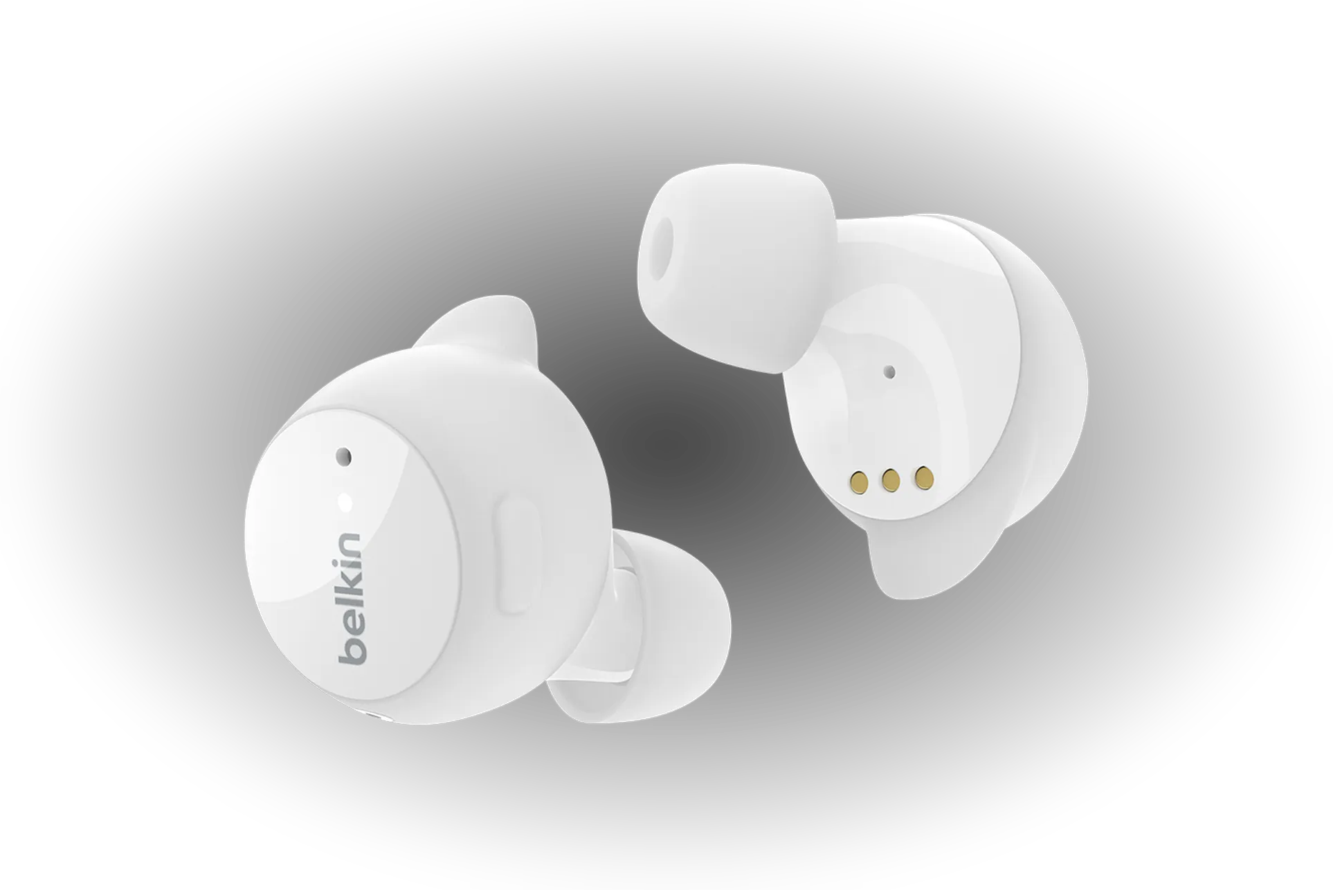

SoundForm: creating foundational design for Belkin
Lead product design on the SoundForm companion app for wireless earbuds, then the design system I built in the downtime after 1.0, as the last designer standing.
- 1.0 shipped to both stores; 100K+ downloads
- 37 → 224 components, light and dark
Product Design
Shipping SoundForm 1.0 as the last designer standing.
Shipping when the team leaves
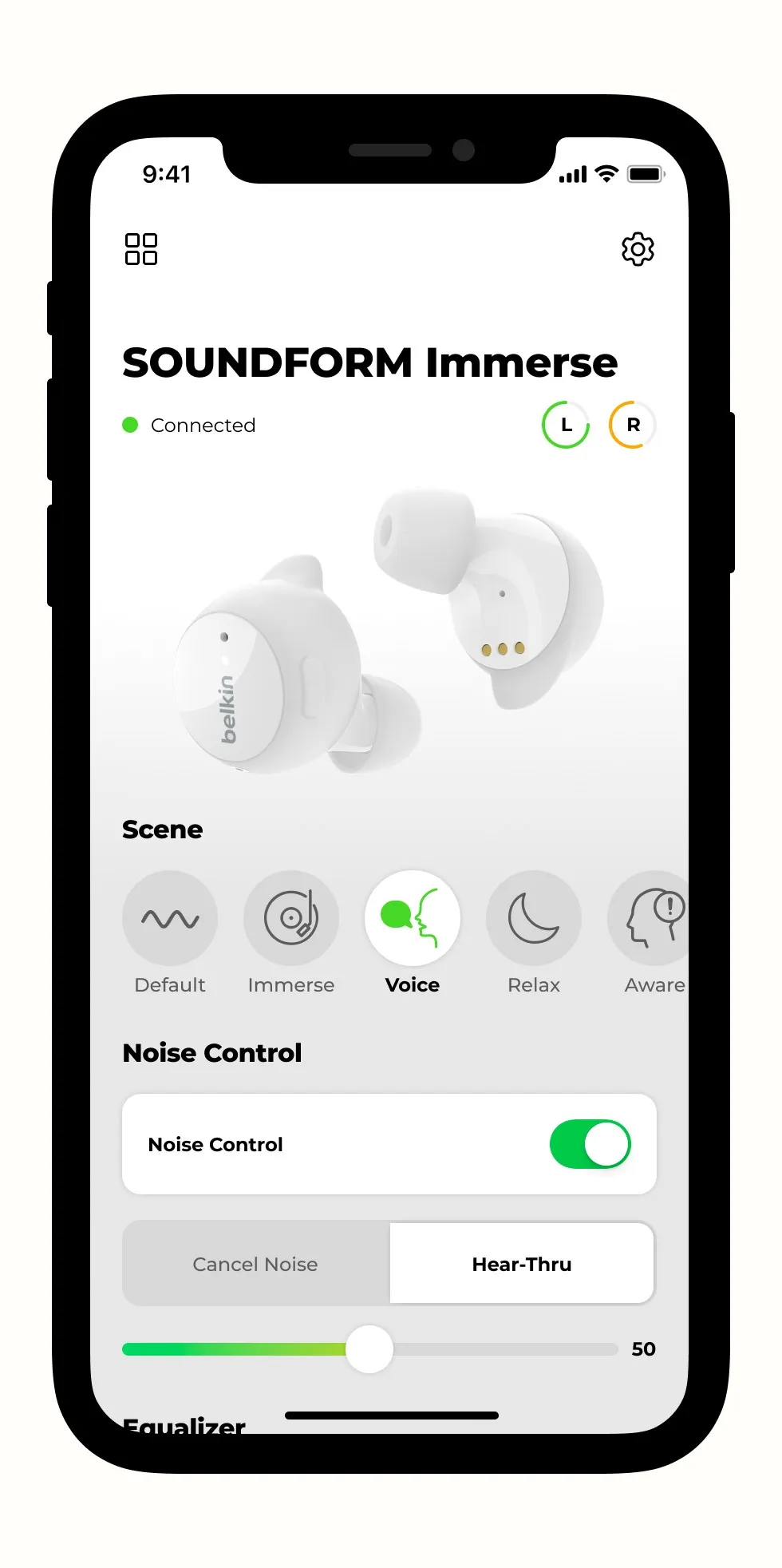
Belkin needed a companion app for its first prosumer earbuds, and it needed it to ship. I joined in September 2021, after discovery was done and the core of the app was already built: dashboard, device connection, onboarding. The UX team was a manager and three designers. Within the year every one of them left, and I carried 1.0 to release as the only product designer in the company.
What did Belkin need from the app?
- Outperform competitors in the wireless earbud space
- Lift overall brand perception
- Let people personalize their earbuds through the app
- Scale to Belkin's upcoming line of audio products
What was I responsible for?
- Carrying the app to the finish line as the designers around me left
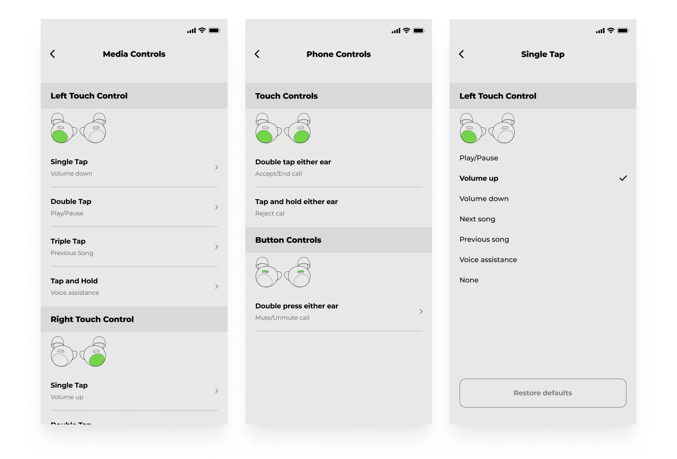
- Designing the feature-focused experiences, earbud controls first
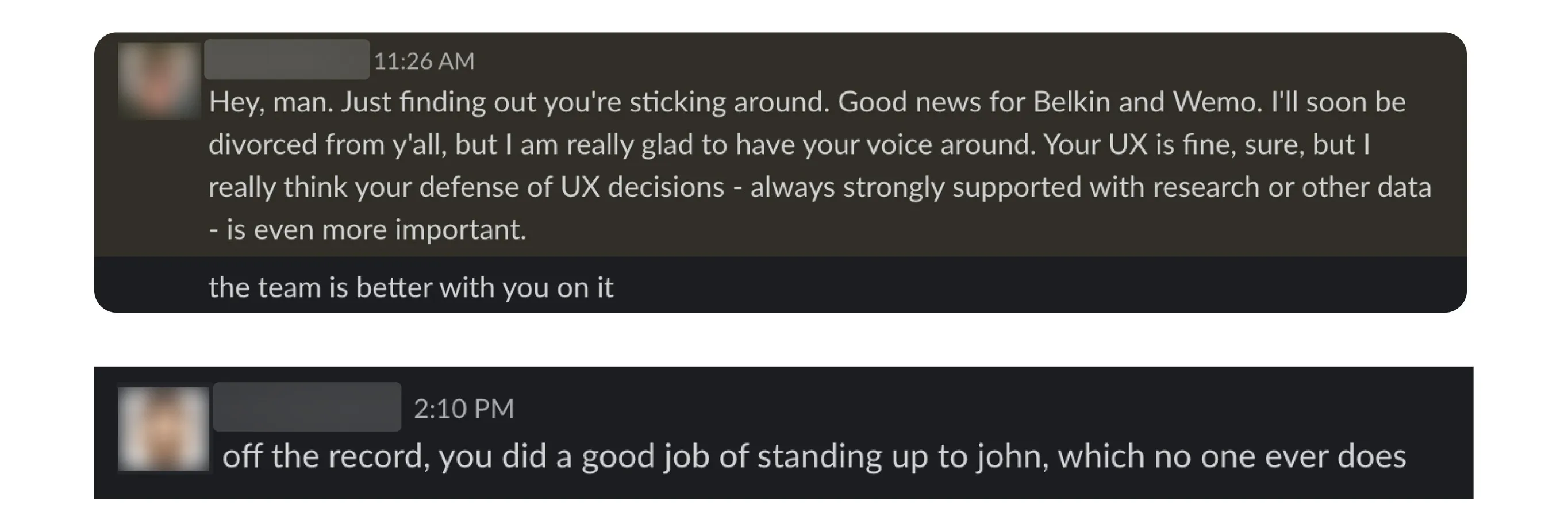
- Defending user-centered design as the sole product designer in the company
- Defining the analytics to track, so the app could learn from its users
- Spearheading Belkin's first design system
Core feature: earbud controls
Final Design
Testing settled it. People struggled to find the settings at all, wanted a visual of the earbud next to every option, and preferred all the controls on one page over separate tabs. Tabs were the tidier option; one page was the one people could use.
The Mapping
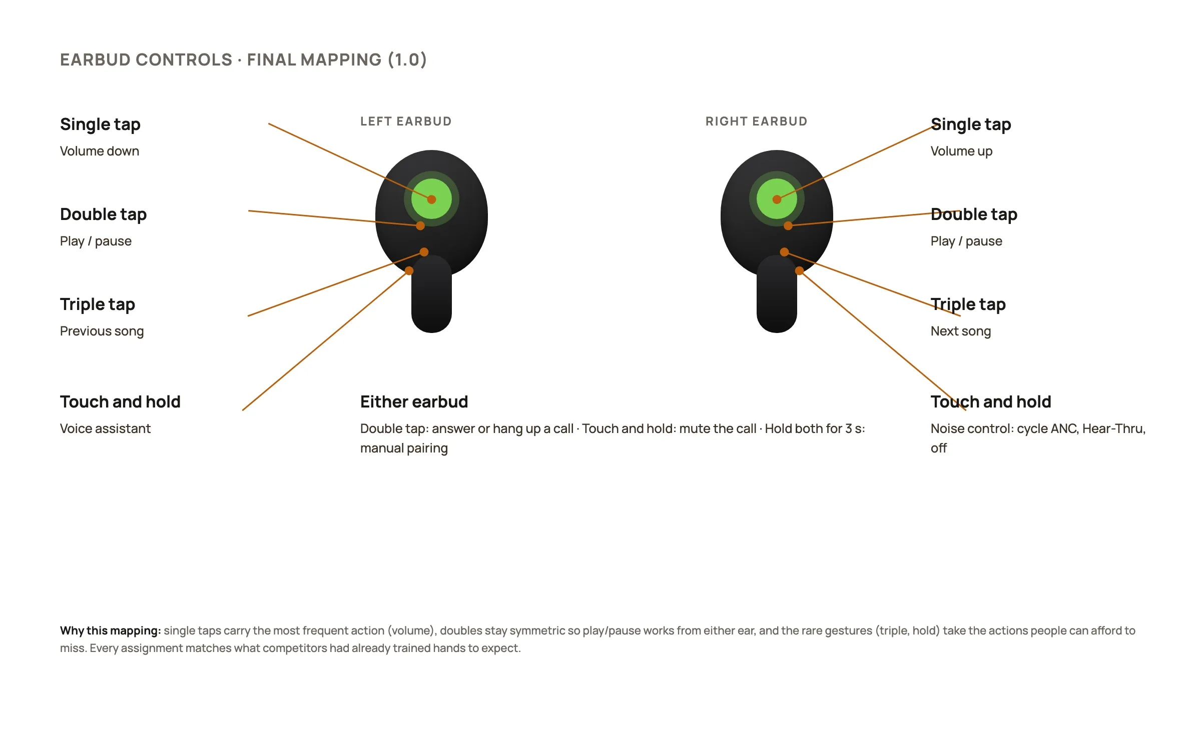
The final assignment, annotated: single taps carry the most frequent action, doubles stay symmetric so play and pause work from either ear, and the rare gestures take the actions people can afford to miss.
Competitive Research
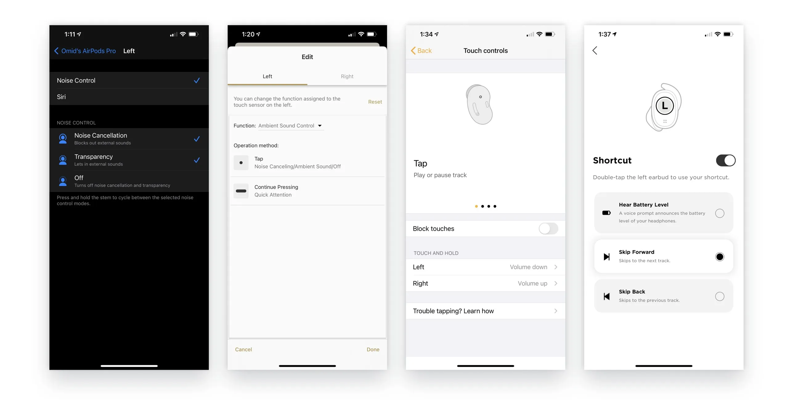
Feature-focused research: I mapped how every competitor assigned single, double and triple taps, holds and noise modes, so our defaults would match what people's hands already knew.
Design Ideation
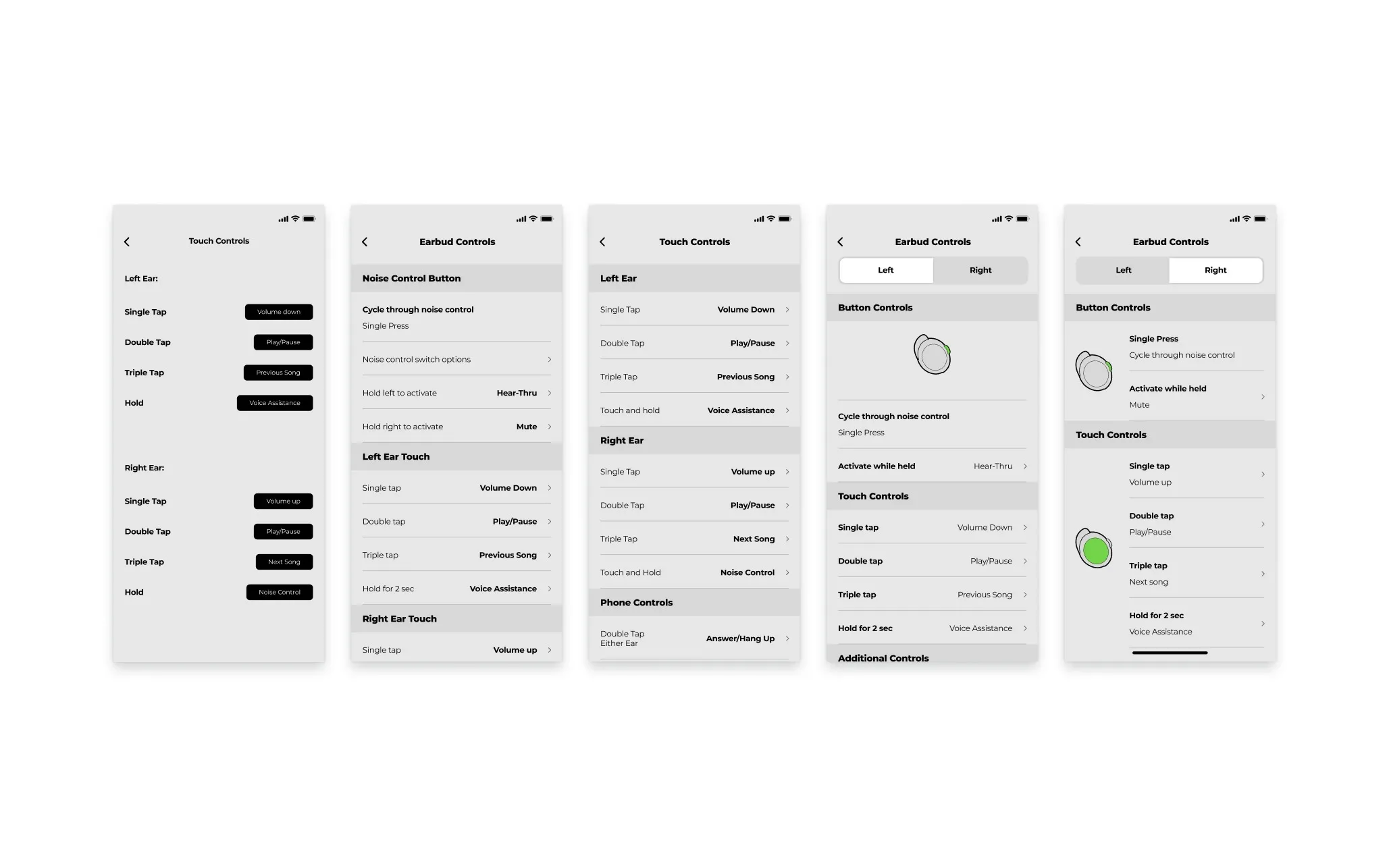
Round after round of mapping tables: left ear, right ear, phone controls, noise control, hear-thru and mute, until every gesture had one clear job and nothing collided.
Engineer Handoff
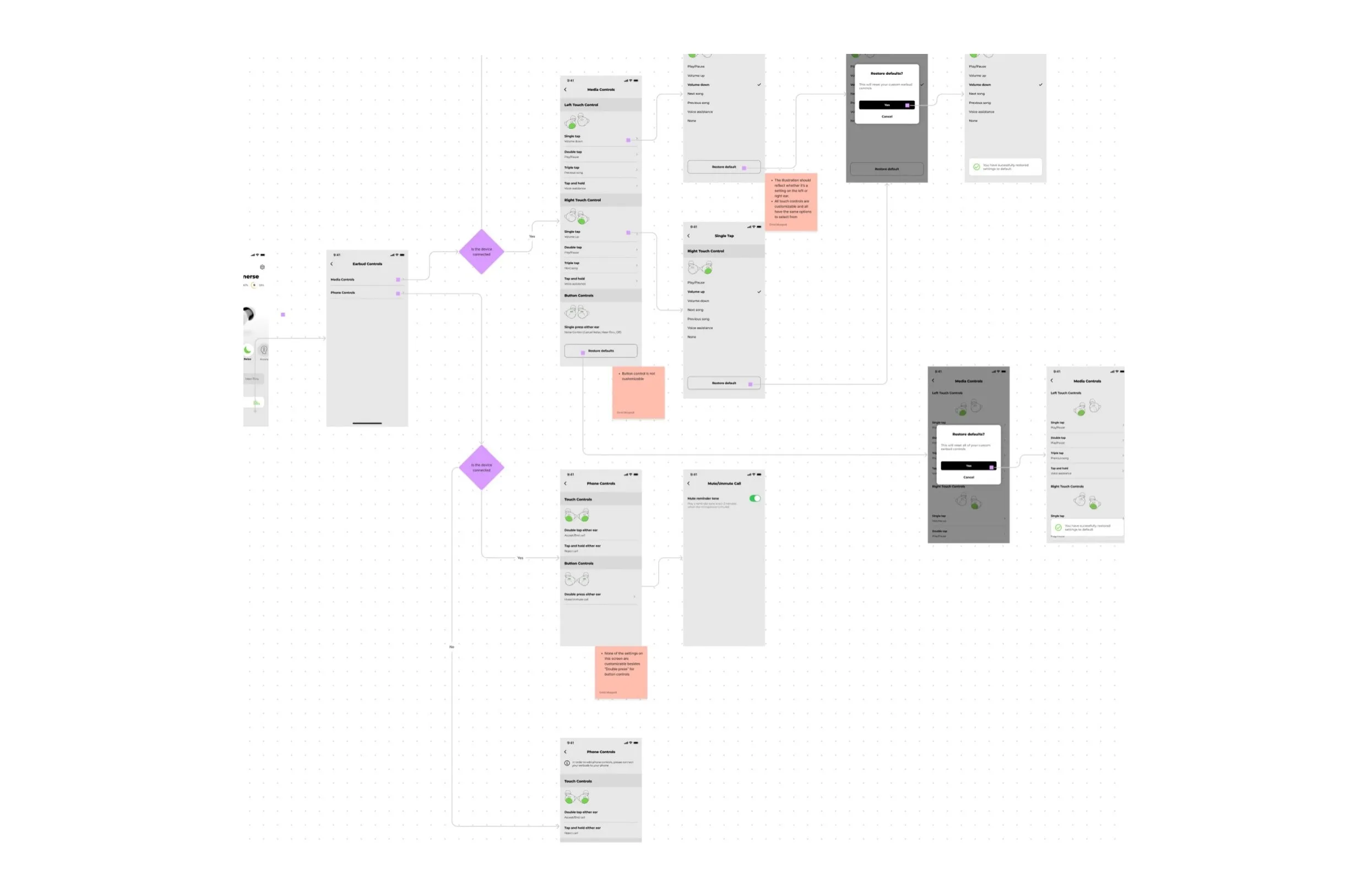
Every condition in the experience went to engineering as a flow diagram, so no state was left to interpretation.
How would we know it worked?
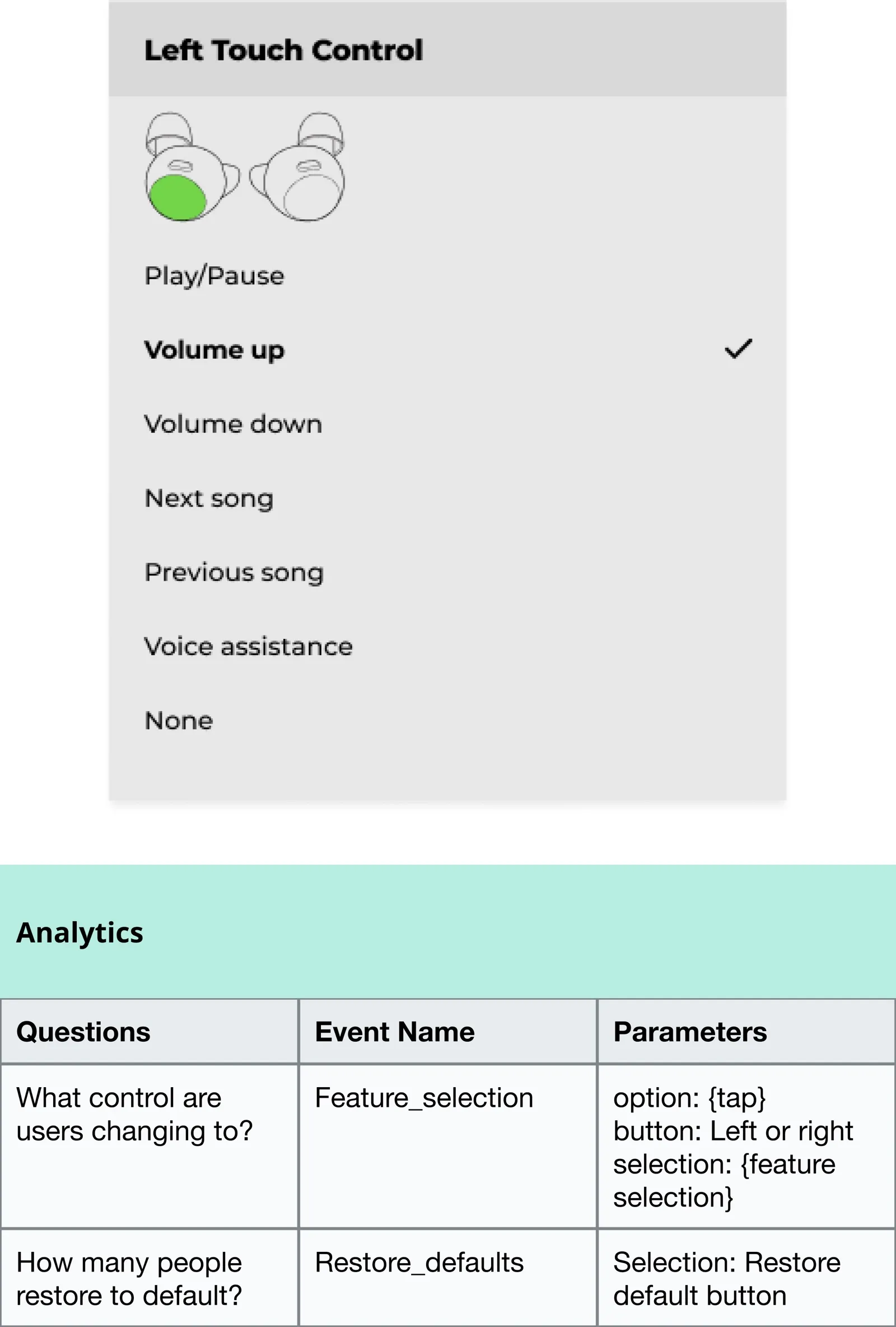
No analytics existed, and without data the next designer inherits guesses. I pushed the dev team to build an analytics dashboard, and with every delivery I shipped a table of what to capture and why. 31 tags went in with 1.0.
What did 1.0 look like?
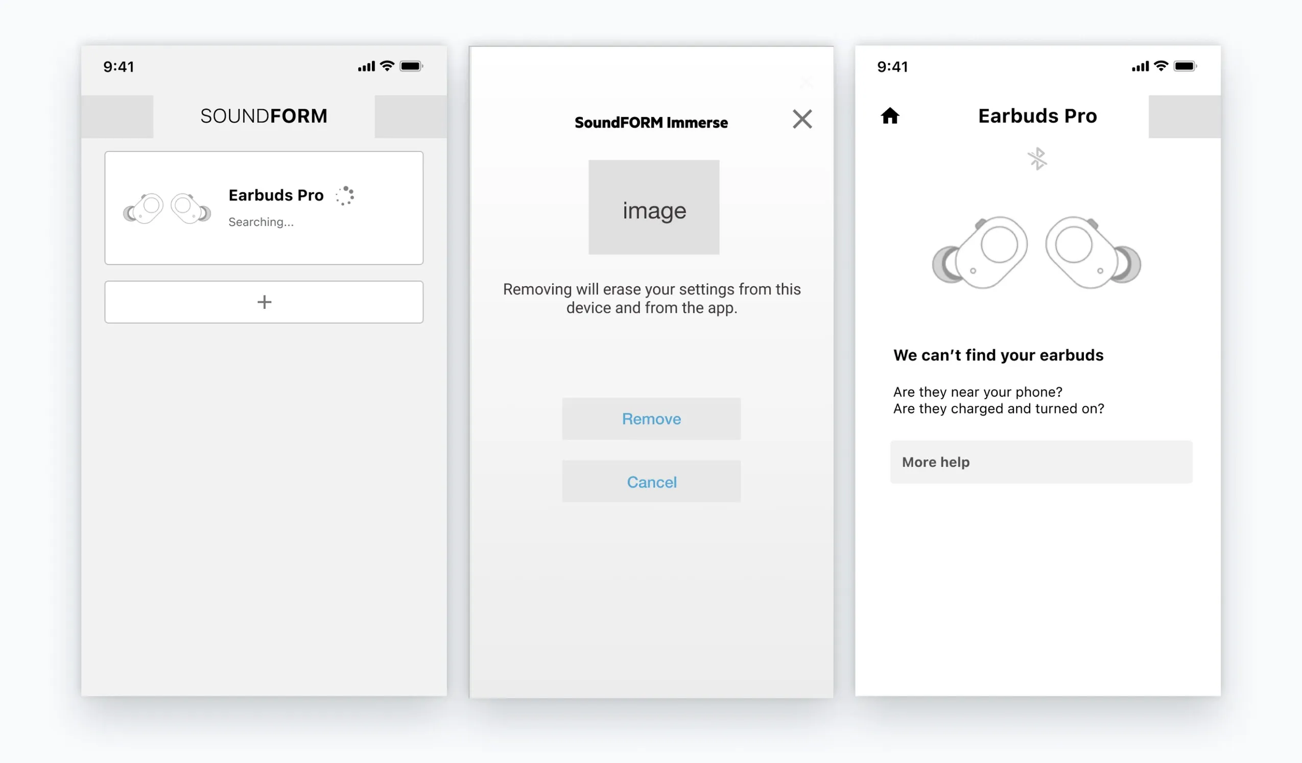
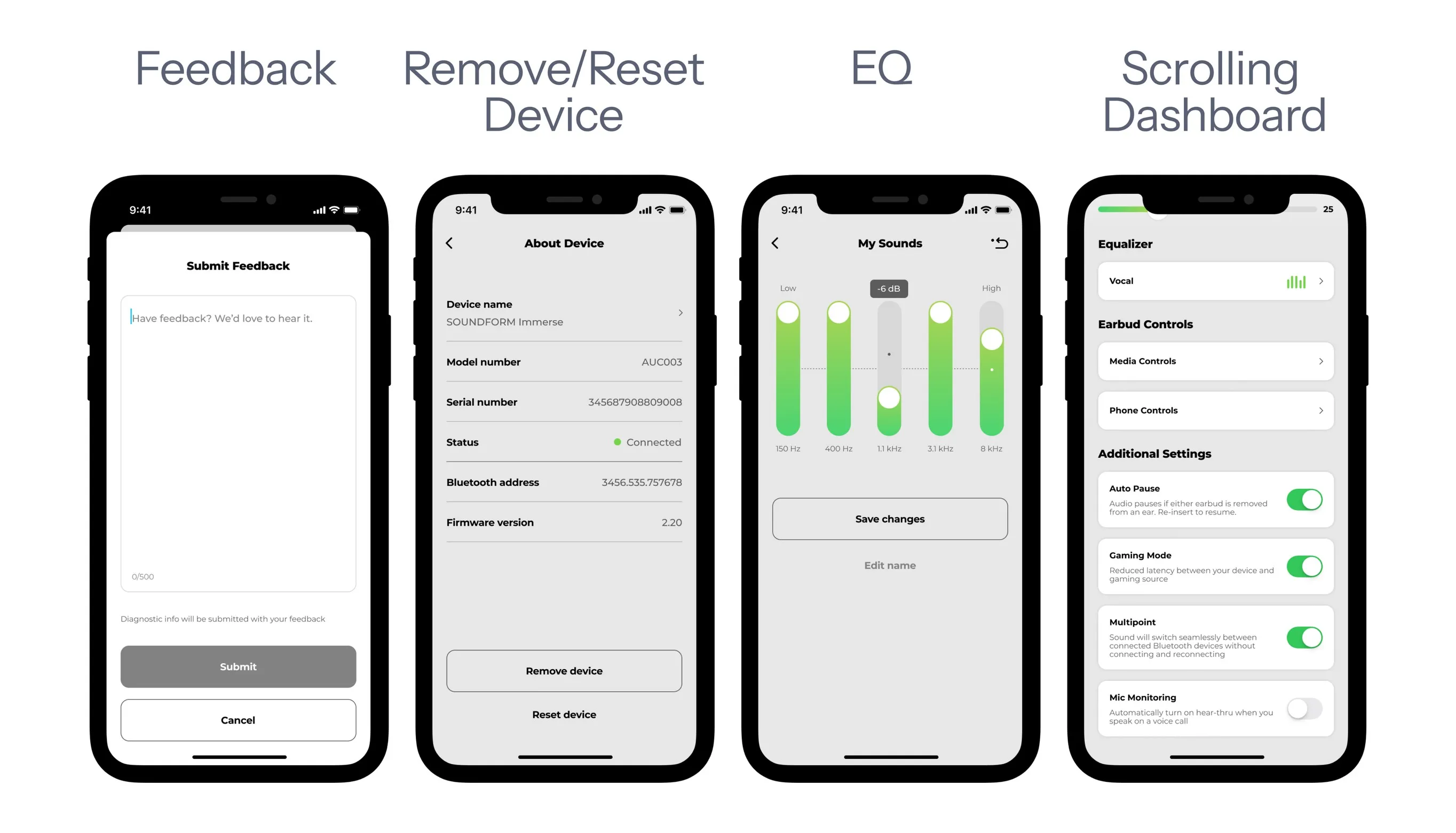
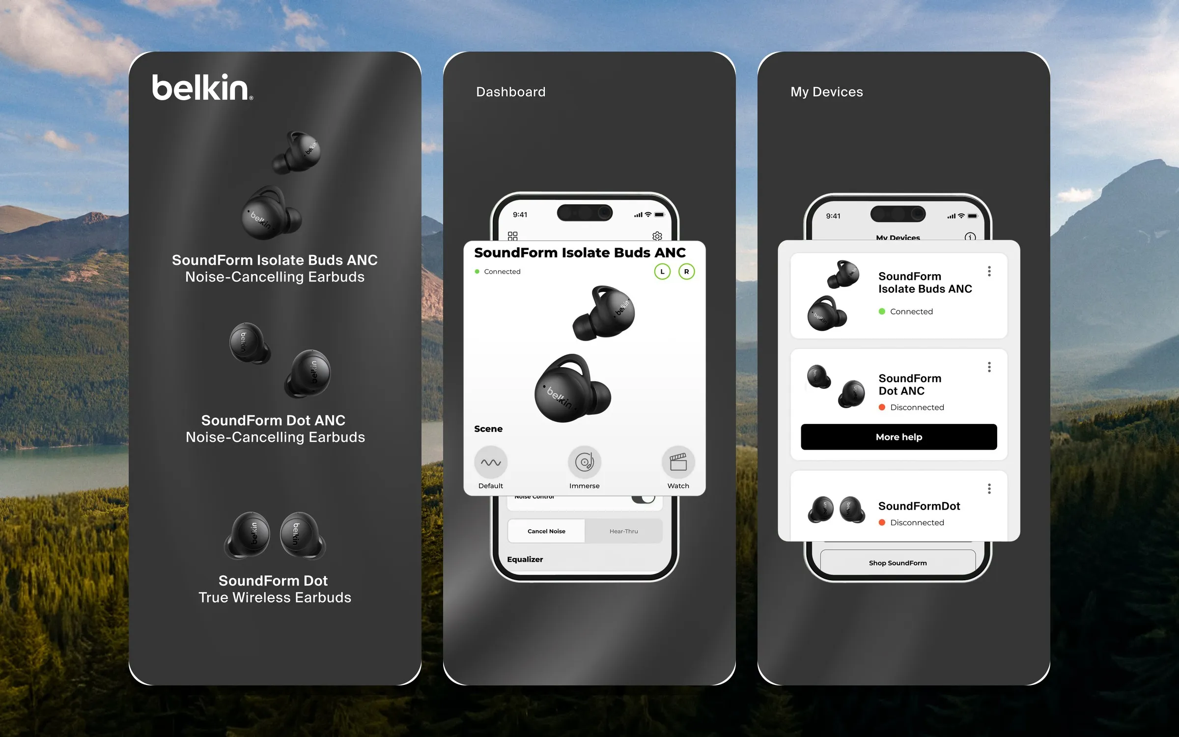
A complete and cohesive 1.0 on iOS and Android in May 2022: feedback, remove and reset device, the EQ, the scrolling dashboard, each feature-focused and handed off with its own flow. A ~120-page handoff, 12 UX flows, and 31 analytics tags logged for whoever came next.
Systems Design
The four months after launch, spent building the foundation the next products would stand on.
Setting the foundation
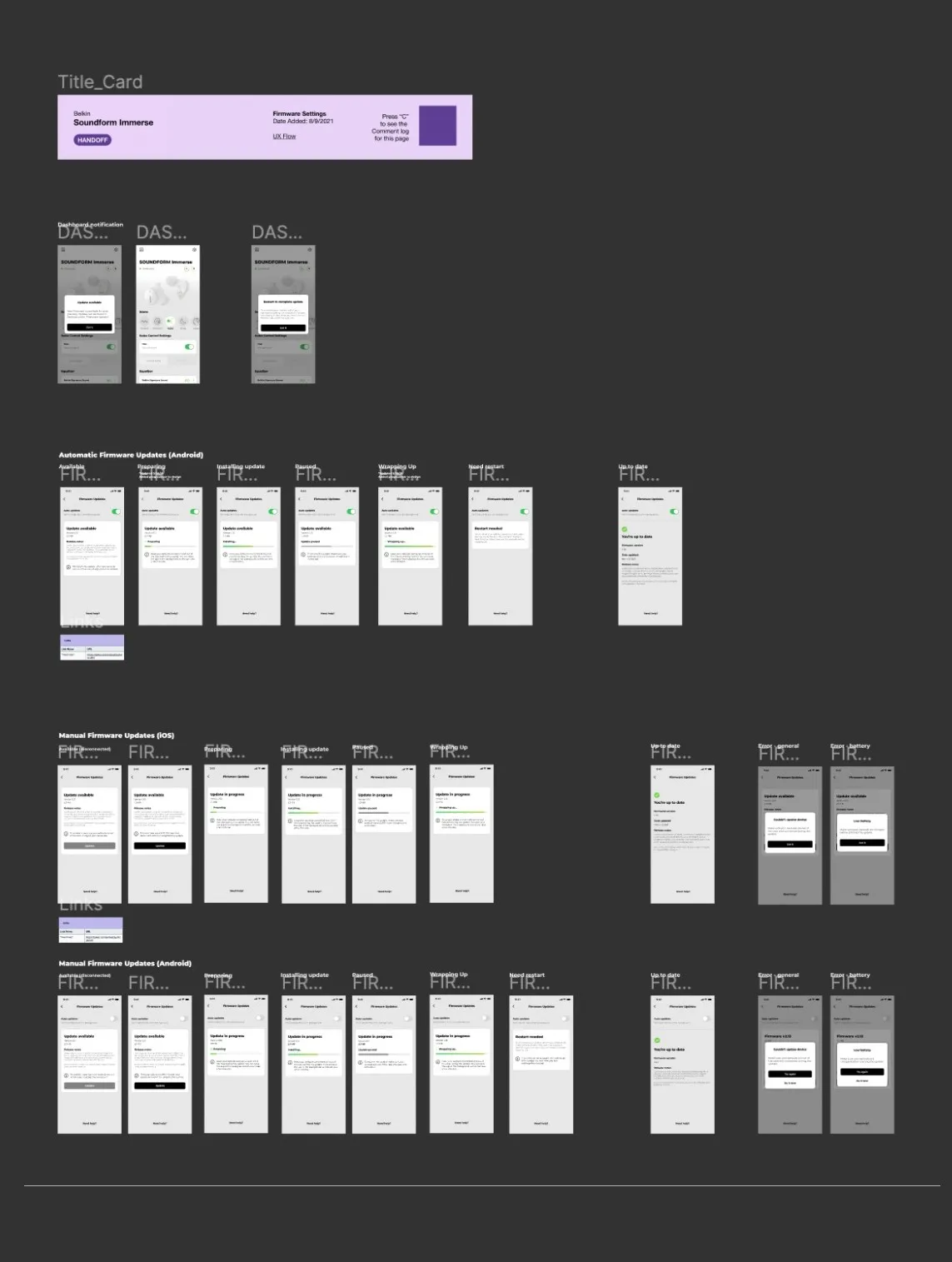
With 1.0 out I finally had downtime, and a handoff file that punished every change. If a component needed an adjustment, I applied it by hand across every design that used it. A product line was coming. I wanted a foundation for design at Belkin, for myself and for every designer who came after me. Cleaning up later would have been faster for a month and slower for the year.
Creating a robust library
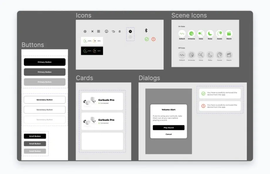
Before
37 components, none used as parent components, none tied to a text or style library.
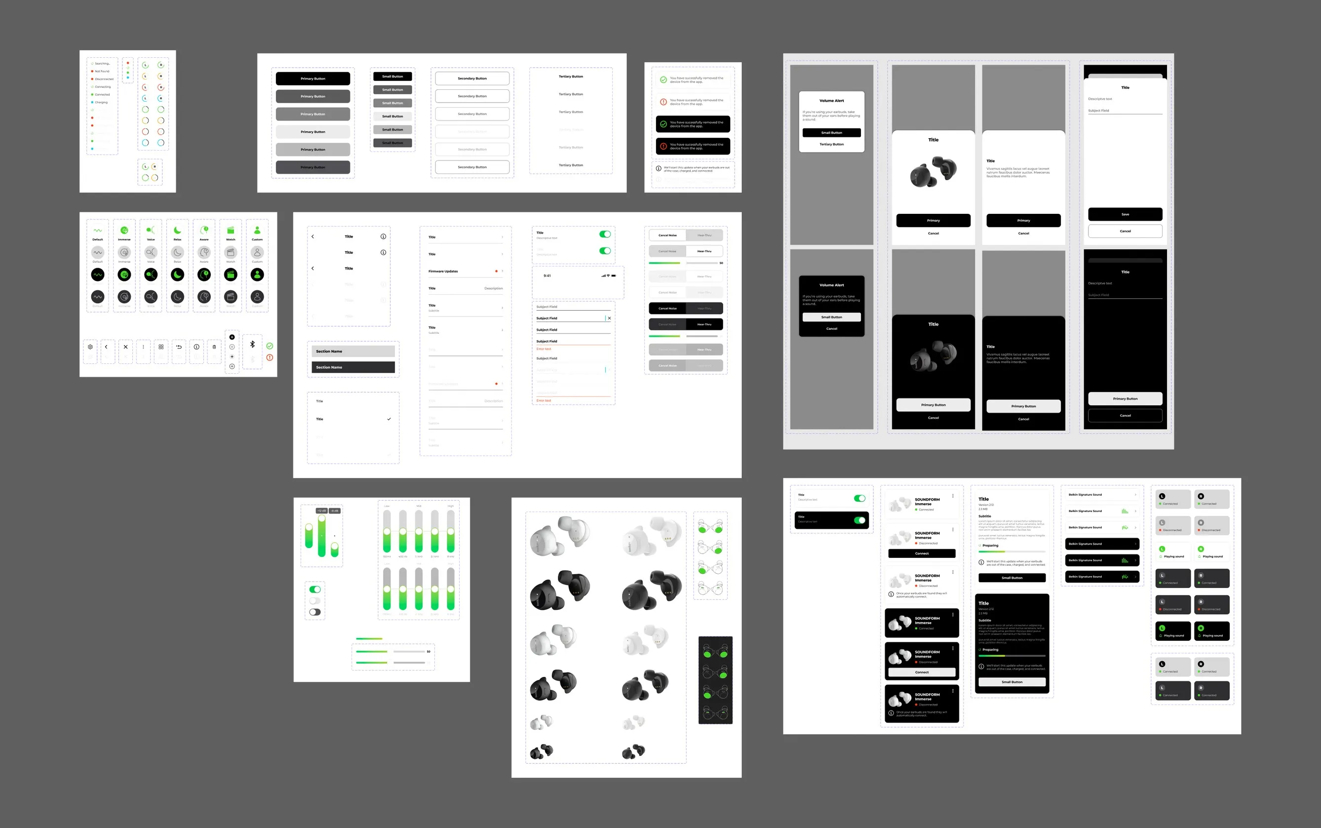
After
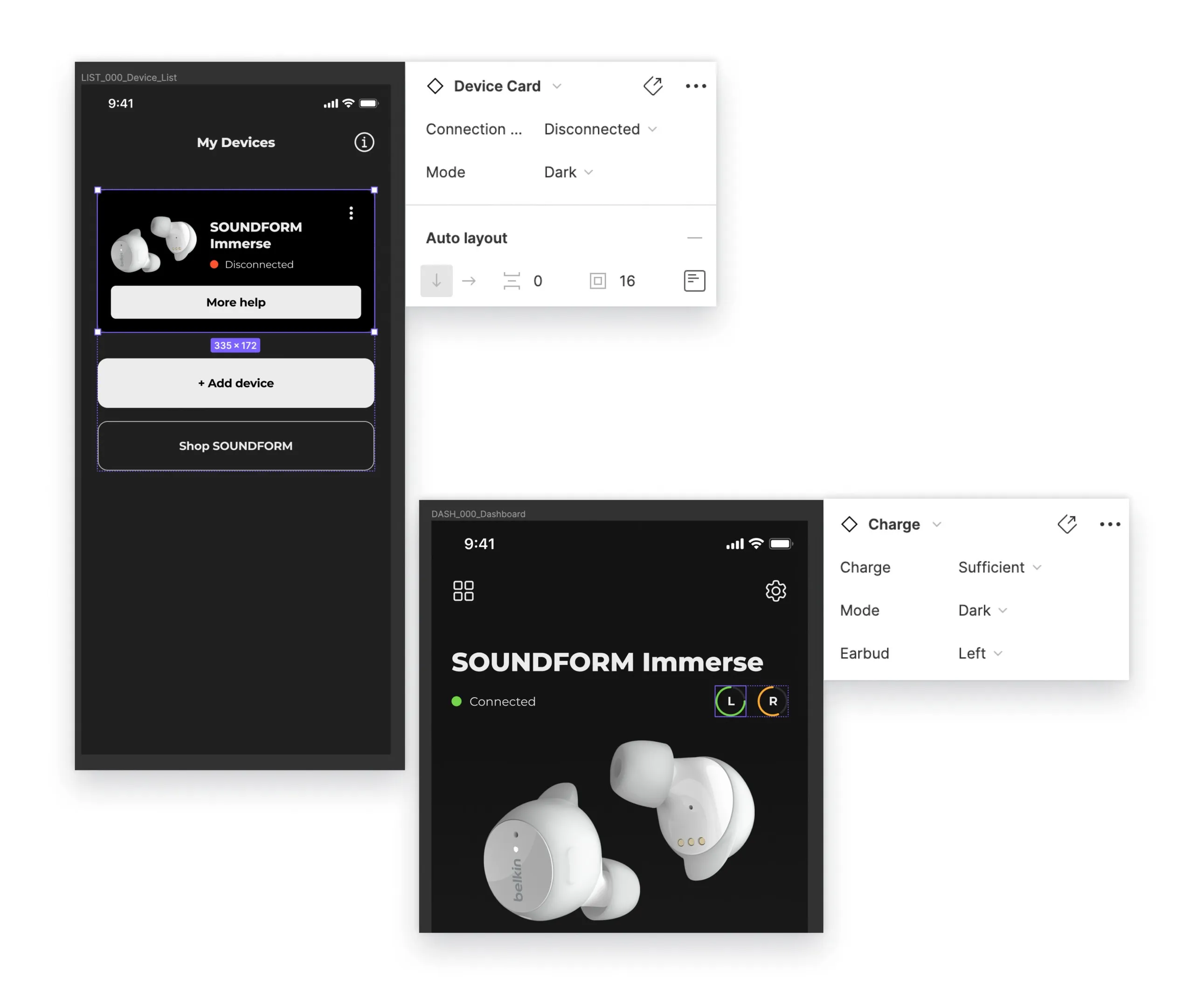
224 components built on atomic design, every one tied to the style library, with dark and light mode variants.
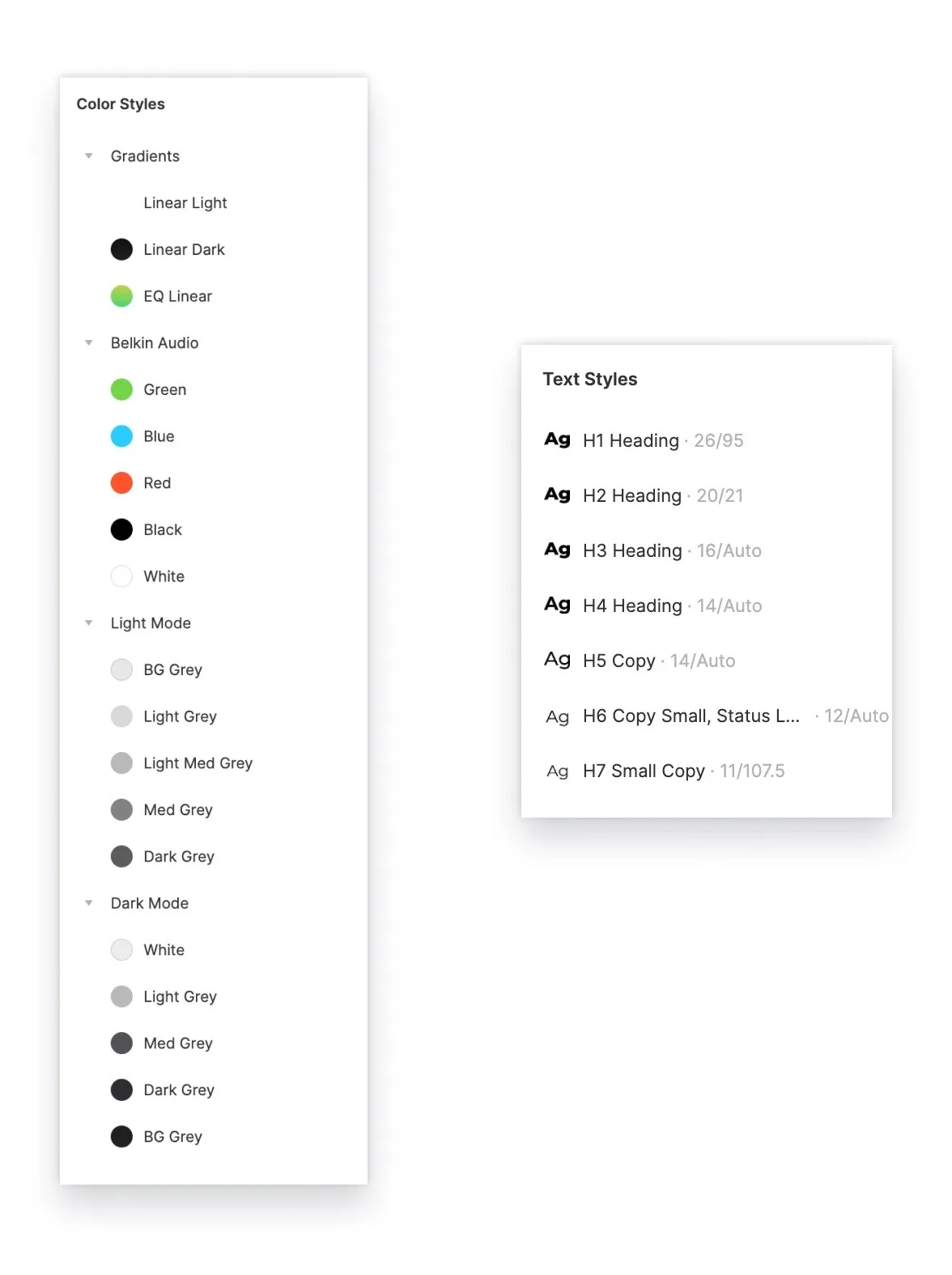
What did every component draw from?
Color and text styles that every component in the library draws from set the foundation for future change: an accessibility color fix or a new typeface happens once, not screen by screen.
The audits
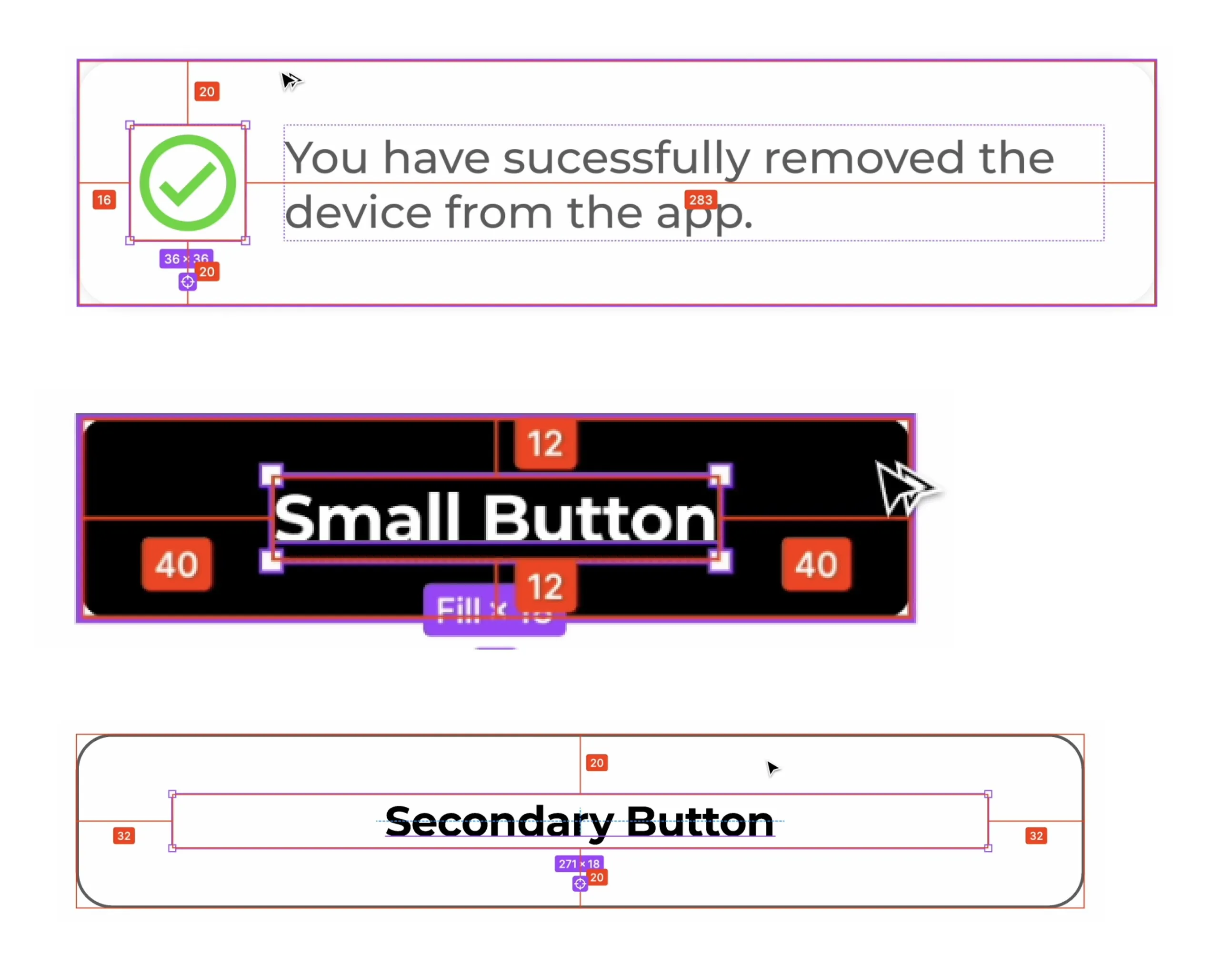
Component audit
Pain points in padding and spacing found and fixed, everything pixel perfect, on a spacing system of multiples of four.
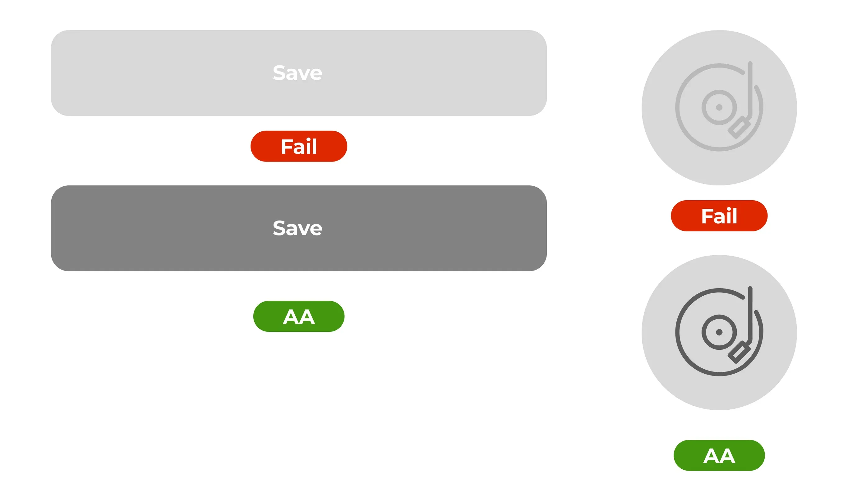
Accessibility audit
Every color and component in the app checked for ADA compliance.
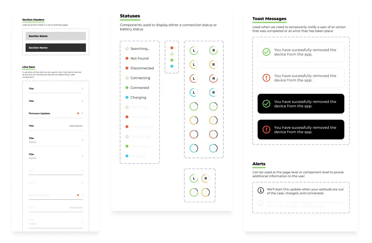
How was it documented?
- An organized library that documents every component and how it is used
- Written for the designers who would come after me, even though I was the only one at the time
What changed once it existed?
Designing on the fly. Standardized components gave every design consistency by default, and the speed to prototype and iterate in the same sitting. The 150+ screens that followed were built about 95% from system components, in light and dark.
1.0 shipped on both stores, then a foundation built for the designers who came next.
- Released on iOS and Android, May 2022
- ~120-page handoff, 12 UX flows, 31 analytics tags
- 37 → 224 components, atomic, light and dark, tied to a shared style library
- 150+ post-launch screens built ~95% from system components; redlines and docs for future designers
Still in both stores today: 100K+ downloads on Google Play, and the app was updated through version 1.3 after I left.
What I'd do differentlyI learned that a design system is sometimes what you build with the quiet after a launch, not a maturity milestone you wait for. Being the last designer standing meant every hand-propagated change cost me, so the foundation was the most selfish and the most generous thing I did: it made my next screens fast and left the next designer a library instead of a pile. I also learned to fight for measurement early; the analytics table was the least glamorous thing I did and probably the most useful to whoever came after me. What I would do differently is compress the control-mapping research into decisions faster; I spent time documenting competitor mappings that a single annotated diagram would have covered.