
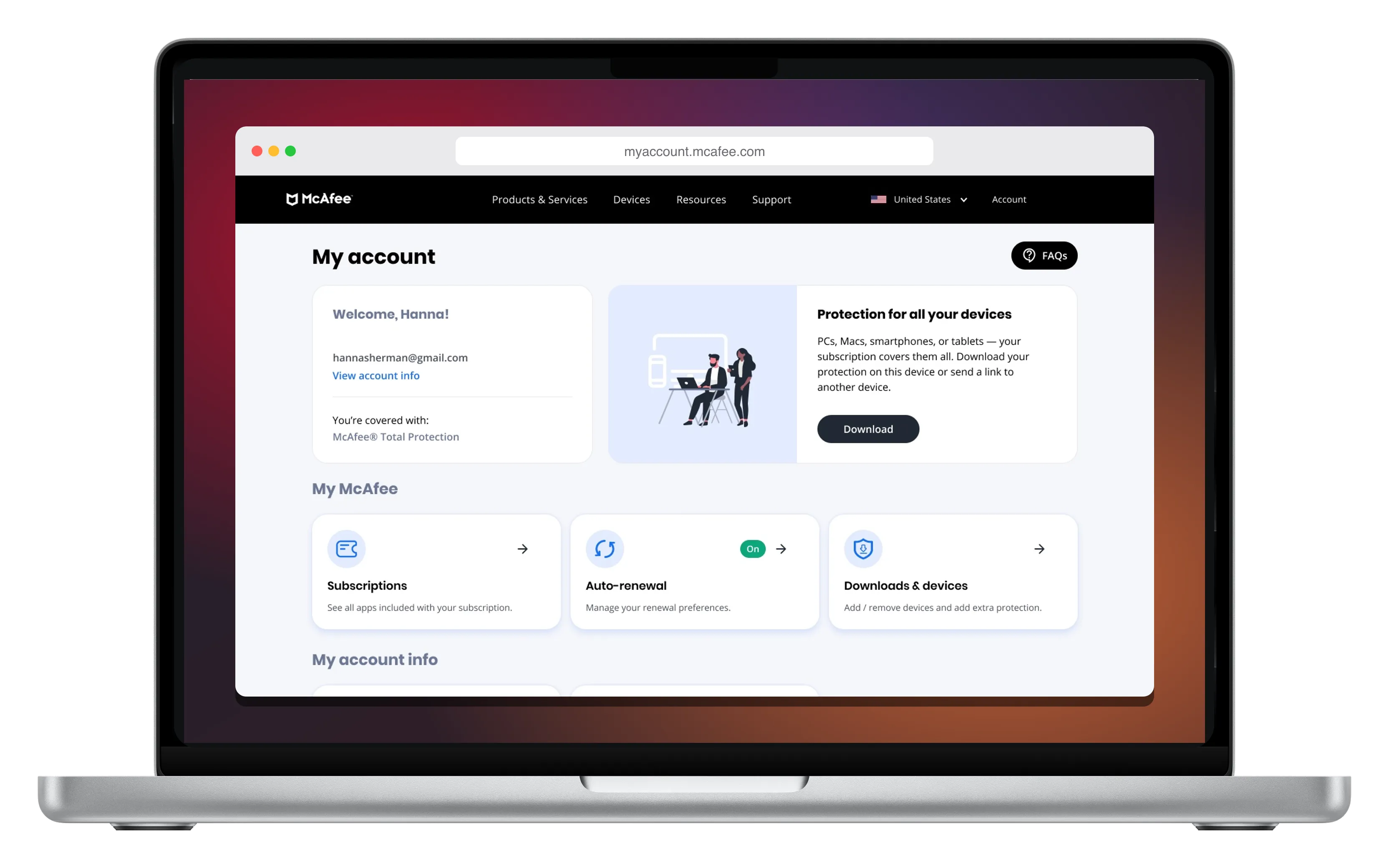

My Account, rebuilt around three jobs
A new My Account for McAfee subscribers (download, subscription, auto-renewal, devices), driven by research. The new opt-out flow cut auto-renewal cancellations by 33%.
- 33% fewer auto-renewal opt-outs
- 90% found renewal settings unaided
Why were subscribers getting lost?
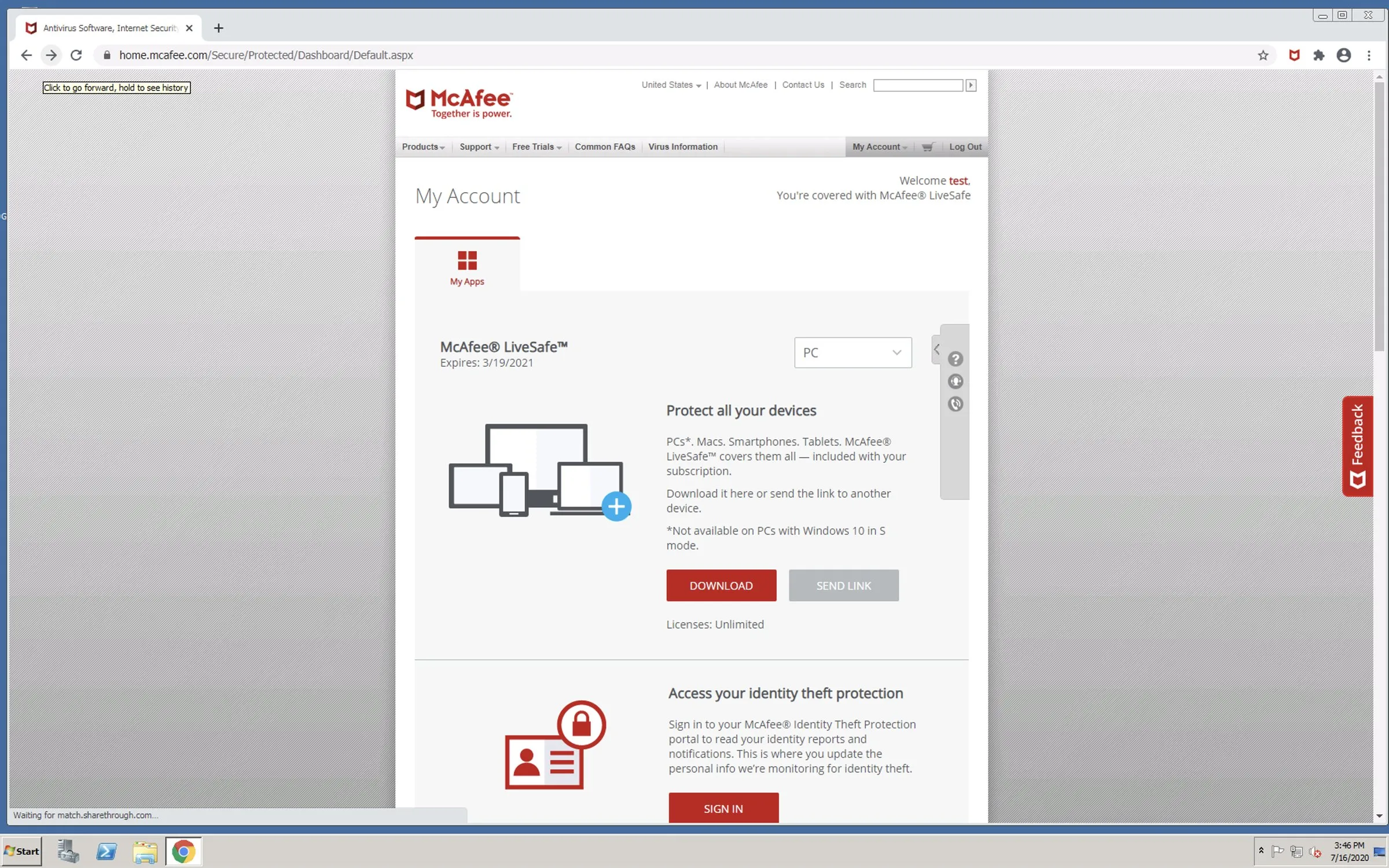
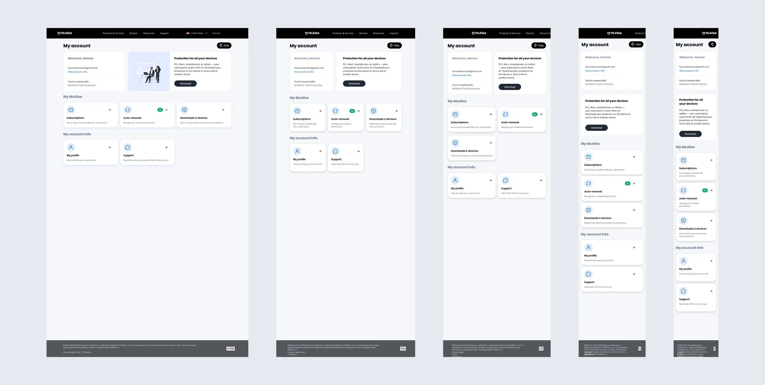
The brief I was handed in January 2020 was framed as retention, not usability: stop people turning off auto-renewal. But My Account was where every McAfee subscriber landed to download their software, check what they were paying for, or cancel, and the page made all three hard. Navigation sat in a dropdown. Devices hid in tabs. Redundant pages overlapped. Nothing on the page said what the subscription was worth.
When analytics finally arrived, 35% of the people who reached the auto-renewal setting turned it off, and under 5% turned it on. Lost people cancel.
Listening before redesigning
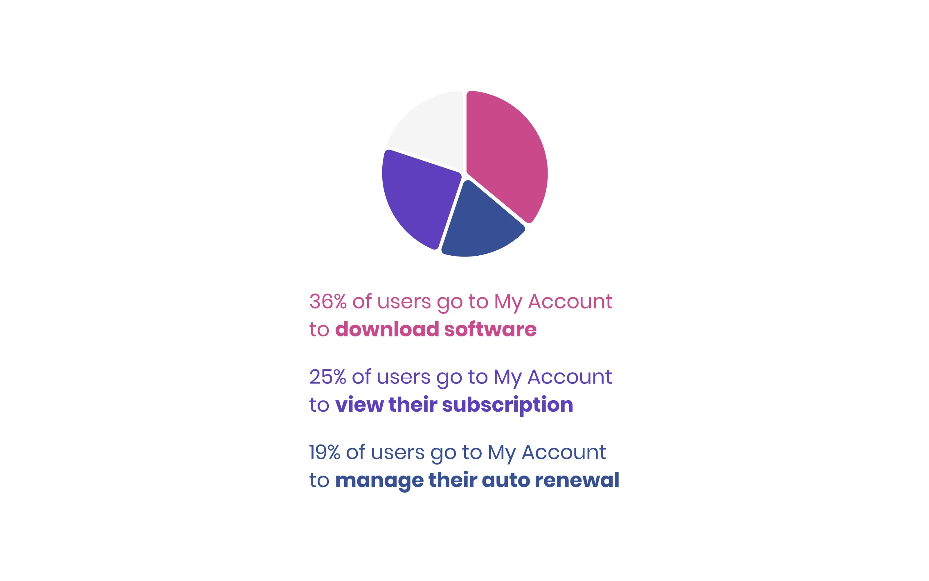
I started from McAfee's own task research: a survey of 2,452 customers recruited from the My Account pages, asked what they came to do. Three tasks dominated: 36% came to download software, 25% to view their subscription, 19% to manage auto-renewal. Everything else (buying, adding devices, billing, receipts) sat under 20%.
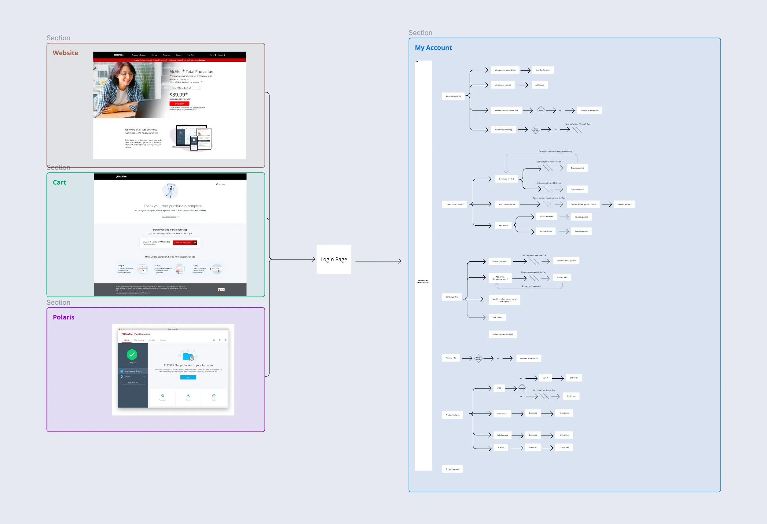
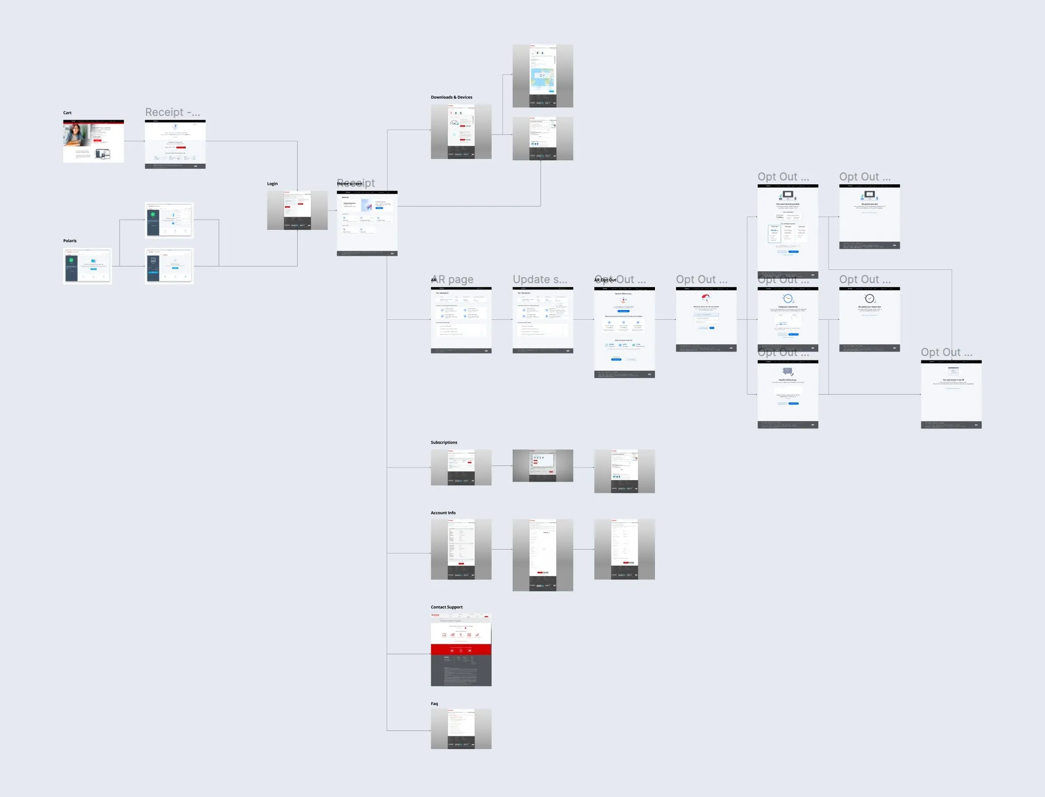
A heuristic evaluation of the existing pages named the failures: no clear navigation, no obvious way to manage devices, redundant pages, and no value proposition. Then I mapped the whole journey end to end, every entry point and every page, so I knew what to define and what to strip.
Why not just hide the off switch?
The elephant in the room was the auto-renewal toggle. The business goal was fewer people turning it off, and the plan on the table was to make it hard to find. That is a dark pattern, and it buys a number at the cost of trust.
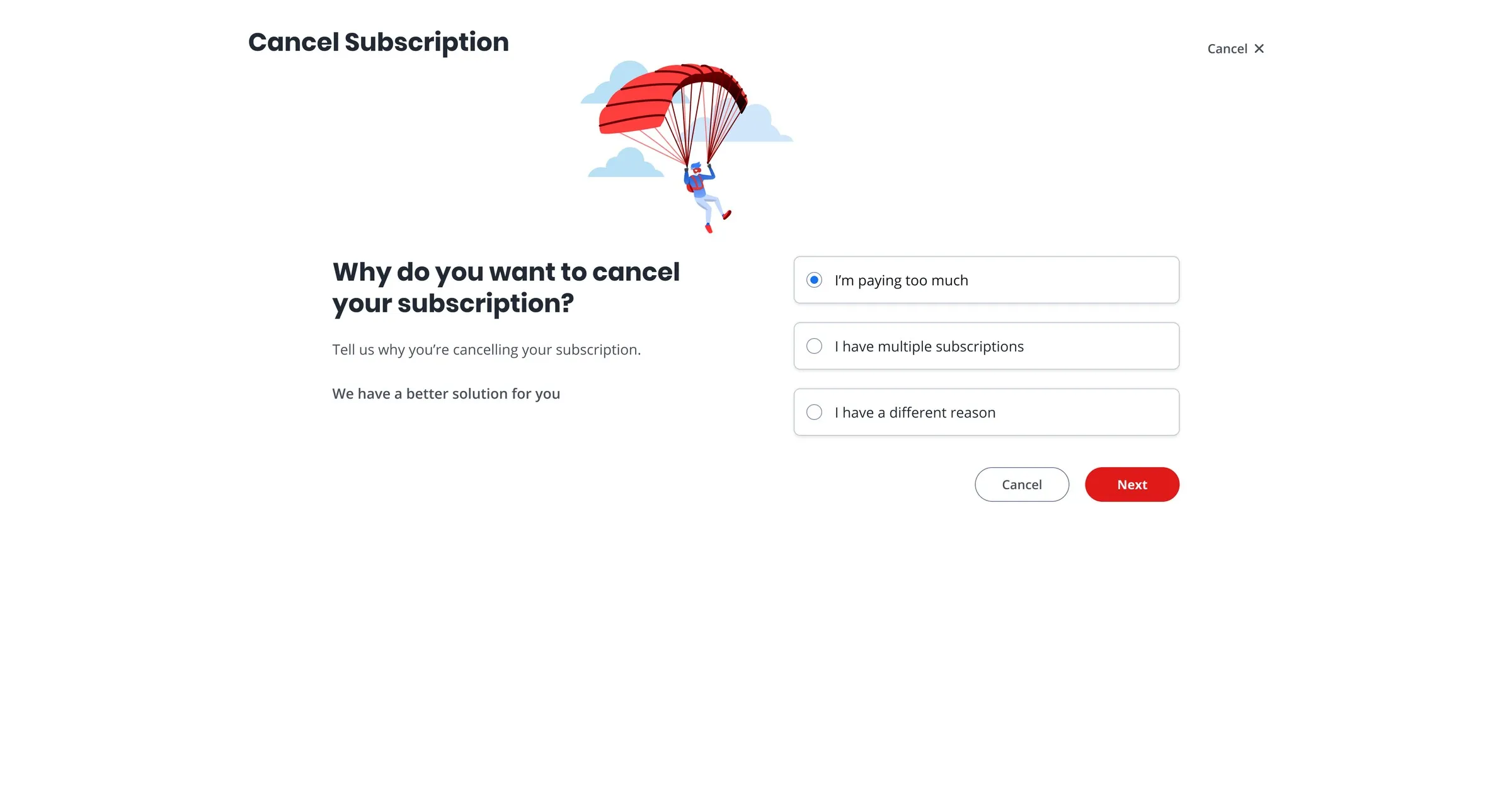
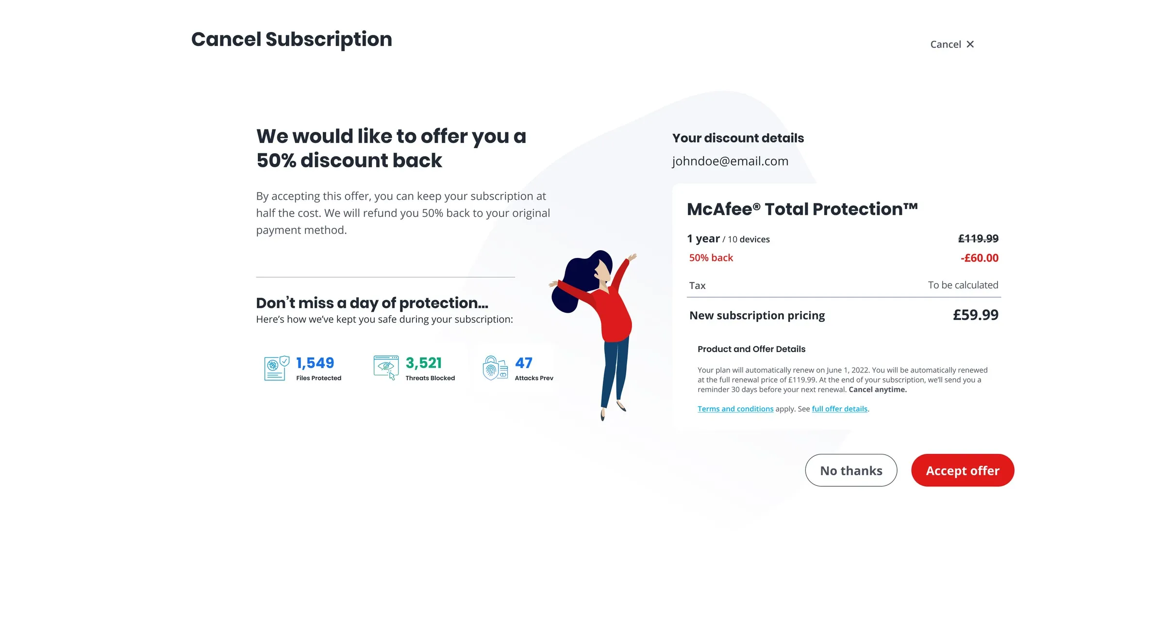
I argued for the opposite bet: keep cancelling easy to find, show people the value of what they would be giving up, and offer alternatives that might fit them better, a discount, a plan change or a clean refund. If the product was worth keeping, the page should be able to say so. That reframe became the spine of the redesign: the home page, the subscriptions page and the opt-out flow all serve it. Measured against the July 2021 baseline of 35%, the flow that shipped cut auto-renewal opt-outs by 33%.
What did the research change first?
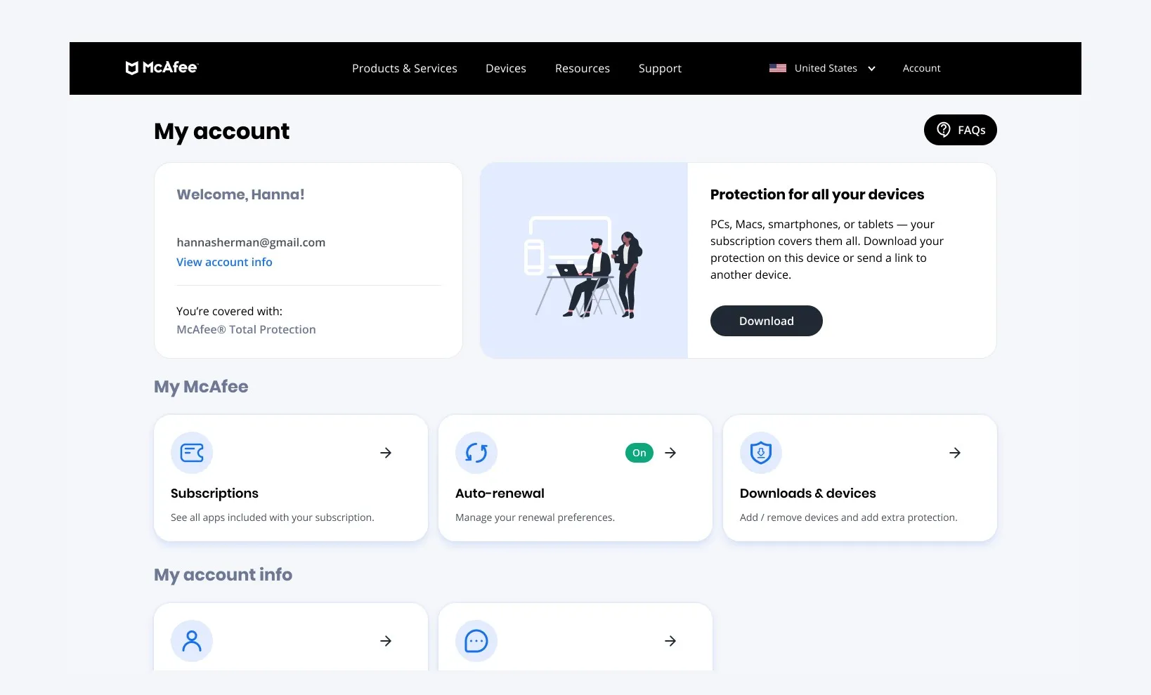
Put the three measured tasks front and center as cards on the home page, in the order people actually came for them, and cut every page the journey map showed was redundant. Marketing and the PM had preferred keeping the inventory and improving each page in place. The survey numbers were the argument that won: 80% of visits were three jobs, and the old home page served none of them in one click.
Where does the value live?
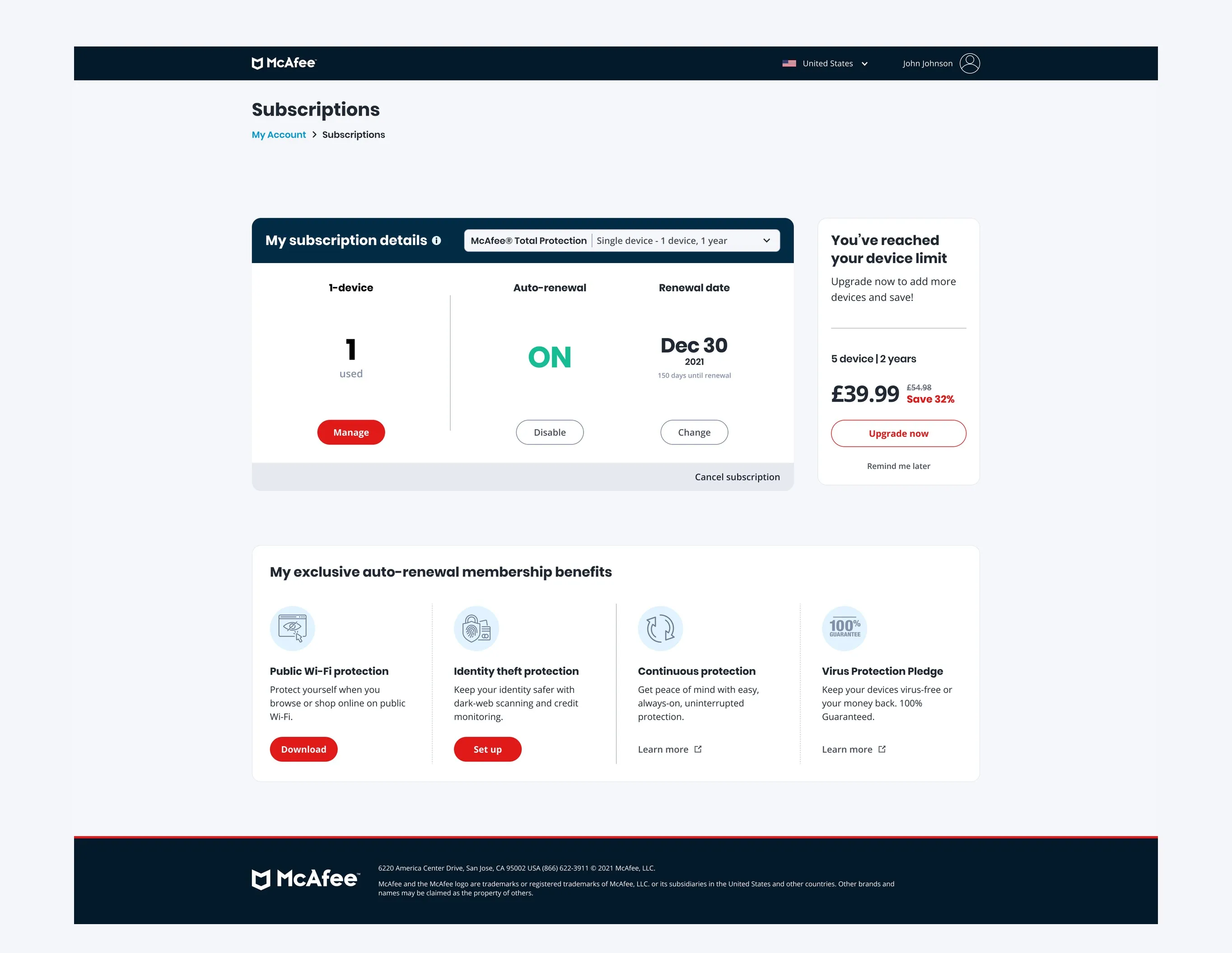
One subscriptions page with the auto-renewal setting in context, next to what the subscription buys: covered devices, included products, the membership benefits, and a prompt to add the devices the plan already pays for. Merging two pages was the risky call, so I tested it before pitching it as final: 90% of testers found the auto-renewal setting here unaided.
Core feature: the opt-out flow
A better fit
Cancel for price and the flow offers half off the plan you already have, with the record of what it has done for you: files protected, threats blocked, attacks prevented.
A clean exit
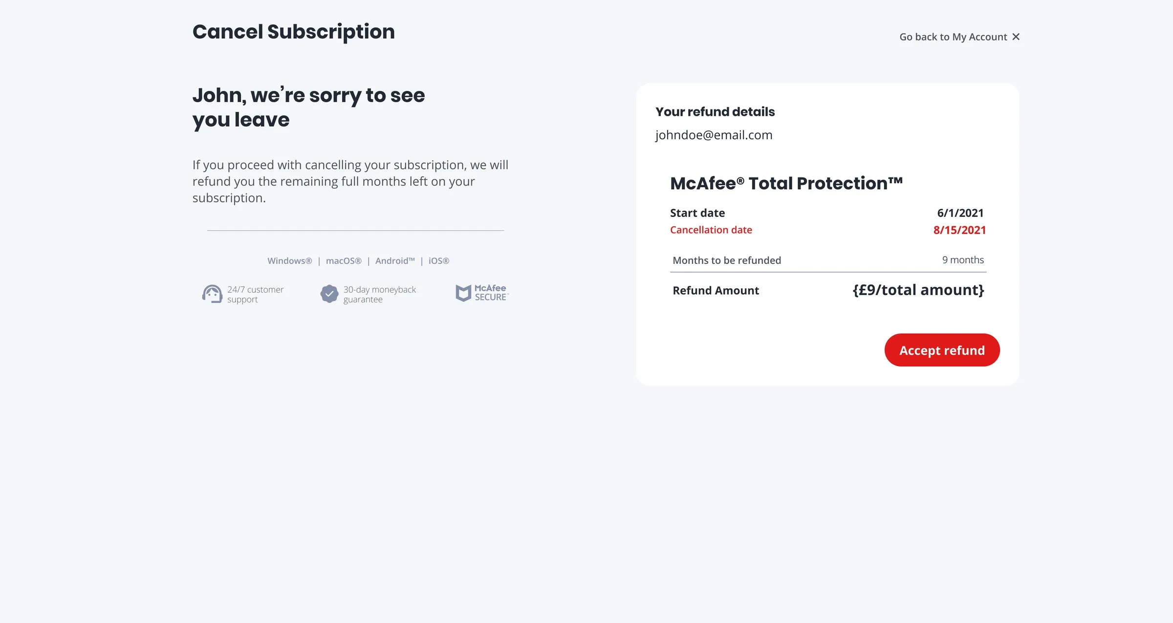
Decline the offer and you get a plain refund statement: start date, cancellation date, months refunded, amount. No second offer, no dark corner.
Before 60 days
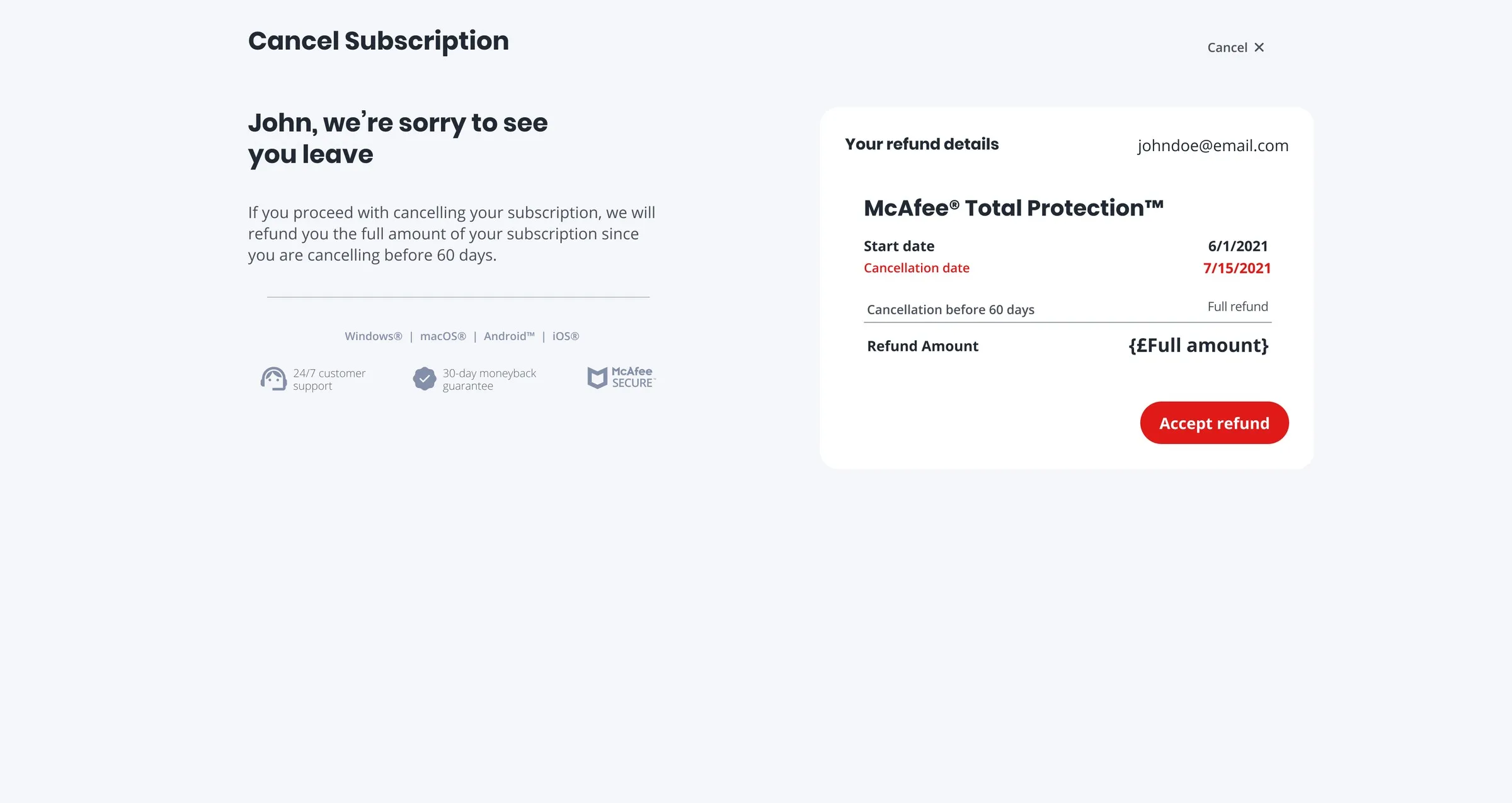
Cancel inside the first 60 days and the full amount comes back, stated up front, with the guarantee on the page.
How do people think about devices?
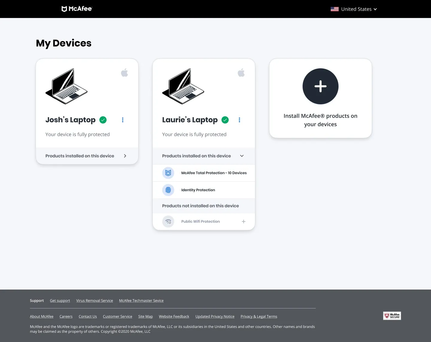
Devices were the hardest structural problem. Most customers had one device, but plans covered up to ten, with several point products and different license counts per product, and the old page offered no way to remove a non-mobile device. I mapped the task flow for adding a product to a device, then redesigned the devices page around the model people already had in their heads: which products are on which device, what needs attention, and how to cover the next one.
A My Account people could navigate, and an opt-out flow that cut auto-renewal cancellations by 33%.
- 33% fewer auto-renewal opt-outs after the new opt-out flow (35% baseline, McAfee analytics, July 2021)
- 90% of testers found the auto-renewal setting on the merged subscriptions page
- Home, subscriptions, the opt-out flow and devices live in production
- IA rebuilt around a 2,452-person task survey: 36% download, 25% subscription, 19% auto-renewal
Shipped in phases; other facets of My Account were still in progress when I left.
What I'd do differentlyThis was where I learned that the strongest argument in the room is a number you gathered yourself. Testing the merged subscriptions page before pitching it gave me a way to defend users against pressure that opinions never would have. What I would do differently is get the analytics in front of the team from the start rather than at the review, so every phase had a baseline to argue from.